Cap Six - Conceptual Explainer
Pre-Production
Concept & Scripting
The CapSix explainer kicked off with a specific challenge: how to visually express a data-driven, merit-based investment strategy using symbolic motion design. CapSix shared their brand assets—logos, fonts, and a brand guide—which gave us our launchpad. These weren’t just static elements—they informed everything from how we designed on-screen titles to how we structured visual contrast: a minimal white background, geometric black detailing, and one signature accent—the red-salmon brand tone—used only for the emerging signal.
Our earliest deliverable was a rough internal storyboard. It wasn’t client-facing, but it was essential for aligning story flow and camera rhythm. The arc was clear and intentional. We start with a scatterplot: a growing field of black dots, each representing an analyst voice. Then we pull back to reveal the plot as a 3D cube. Within that cube, waves pulse from every dot—filling the space with overlapping motion. This is the noise of the market. From that complexity, a single salmon-colored signal line begins to cut through. That clean, sharp line becomes the visual anchor for CapSix’s value proposition. Scripted lines like “Evolved Active Asset Management” were placed to hit in sync with these visual pivots—so scripting and motion were intertwined from the beginning.
In early team discussions, we made a deliberate call to avoid any literal dashboard metaphors. This wasn’t about mimicking financial interfaces. It was about abstracting CapSix’s methodology into a procedural, symbolic system. The story wasn’t literal—it was conceptual: precision emerging from complexity.
Rapid Prototyping (RP)
From there, we moved into Rapid Prototyping with one focus: pressure-test the most technical and symbolically loaded element—the reverberation waves. These waves represent thousands of analyst voices speaking at once. Our first pass used multicolored waves, imagining a rainbow of signal diversity, but that visual noise undermined the clarity and focus we needed. We locked in black linework for all background waves, giving the salmon-colored signal absolute visual priority.
Once we had our visual language, we started refining the behavior of those waves using procedural tools in Cinema 4D. Each animation parameter was tested in isolation, then in groups, then across massive data sets using the Cloner system. Frequency controlled how often each pulse occurred—this set the pace of market noise. Amplitude dictated how far each wave reached—affecting spatial spread and intensity. Speed influenced how quickly waves radiated outward—impacting tempo and visual rhythm. Modulation introduced controlled irregularity—subtle variations that made each voice feel human, not robotic.
We started with spherical waves—they looked good but cluttered the scene fast. So we pivoted to flat, circular waves aligned to the camera plane. That decision made all the difference in maintaining legibility, especially when the camera pushed through dense scenes. Once we had a working wave system, we baked the simulations into Alembic caches to keep rendering stable and predictable.
With wave dynamics in place, we focused on camera motion and scene composition. We built a camera path that zoomed from wide scatterplots into the cube’s core, flying past data points and eventually locking onto the signal line. These weren’t just beauty shots—they helped verify the logic of the animation, ensuring titles and voiceover would hit in sync with the visual narrative.
UI elements and text overlays were built in After Effects, using camera and null data exported from C4D. We layered these early to test balance—making sure they delivered key messages without competing with the 3D content. A key moment involved a “blinded dossier” sequence, where analysts’ performance data was visible but anonymized. It showed objectivity and hinted at the merit-based engine behind the scenes.
Early Visual Styles Explored
Visual development ran alongside our prototyping work. Using Redshift, we rendered test frames with clean, controlled materials: matte white for backgrounds, black for data geometry and waveforms, translucent shaders for the cube, and the red-salmon brand tone for the signal. Lighting came from neutral HDRI maps—no dramatic shadows, just even, analytical illumination. We intentionally skipped textures, gradients, or any stylistic distractions. Clarity and contrast drove every design choice.
We explored adding gradients to the waveforms—more salmon, more gray—but dropped that after internal and client review. Black delivered the highest clarity and helped drive attention toward the emerging signal. Depth-of-field and blur were used lightly—not for effect, but for legibility, especially in fast-moving scenes with lots of overlap.
Color-coded data points—65% red, 15% yellow, 20% green—were initially laid out on flat planes. Client feedback pushed us to rethink that. Instead, we moved to volumetric stacking, which added a vertical hierarchy and visual depth to the data. Using Cloner and effectors, we randomized placement while keeping categories readable. That shift gave the data physical weight—and matched how CapSix turns unstructured market inputs into useful intelligence.
Prototyping Animation Concepts
With waves and data points dialed in, we turned to the final “signal” scene. Early on, we tried a glowing orb, but it wasn’t directional enough. Client feedback pushed us toward a line—steady, analytical, and grounded. It didn’t rise above the noise, it moved through it. That required precision in composition: the line had to be visible from frame one, but grow in prominence. We tested versions where the signal lit up waves as it passed—like a wire carrying current. That direction helped us nail the core idea: intelligence reveals itself through the chaos, not outside of it.
Client Feedback Shaping Direction
Client notes informed every major revision. After the first RP tests, they asked for more irregular wave behavior—less rhythmic, more chaotic. That led to reworking modulation and timing, injecting controlled randomness into the system.
They also gave script feedback: swapping out “We call it Evolved Active Asset Management” for the more natural “Think of it as...” and extending dwell time for lines like “years of investment experience.” Those script tweaks directly changed the pacing—forcing camera holds, revised transitions, and rebalanced scenes.
When we reworked the wave colors and signal animation for more contrast and flow, the client approved the final signal scene.
Style Choices and Reasoning
Every design decision served a purpose. The white world stood for analytical neutrality. The black noise represented impersonal market input. The salmon line was the hero—CapSix’s precision insight. The color logic wasn’t just clean, it was functional: less noise, more signal.
We leaned into geometric minimalism on purpose. No fintech tropes—no dashboards, no charts, no icons. Just motion, logic, and metaphor. The cube meant structured complexity. The waves, human chaos. The line, intelligence. Every camera move, wave flicker, and signal path reinforced that metaphor.
That minimal approach also made scaling efficient. No heavy textures. No GPU-taxing lights. Simple material nodes and a modular system kept everything fast and consistent across all outputs—from the long explainer to the teaser cuts and background site loops.
By the end of pre-production, the animation system was locked. Every wave behavior, overlay layer, and transition had been built, tested, and reviewed. Nothing was arbitrary—every piece served the story.
Full Production (FP)
Look Development
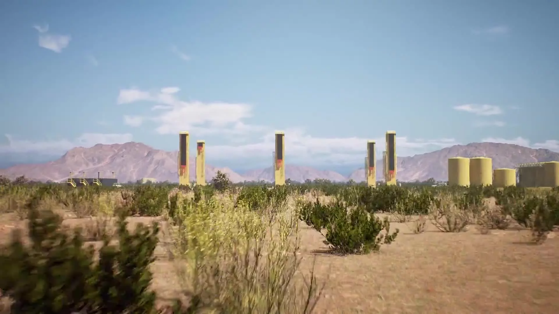
With prototyping approved, production moved into full execution—locking in final materials, optimizing performance, and scaling the animation system. Everything stayed in Cinema 4D and Redshift, and we held firm on the minimalist, symbolic style we established earlier. We refined the material system to keep things sharp and simple: a semi-transparent cube, matte black data points, flat circular wavefronts, and the signature CapSix signal line. No reflections, no bump maps, no specular clutter—just clean silhouettes and maximum clarity.
Lighting stayed consistent with RP. Ambient HDRI environments gave us soft, even illumination with no harsh shadows, so even the densest frames stayed readable. Inside the cube, we introduced gentle volumetric falloff to deepen spatial feel without tipping into stylization. The key was maintaining high-contrast visibility of the signal line—even when we cranked up scene density.
Design & Animation
Once the direction was locked, we rebuilt the system with production-grade assets. Using C4D’s Cloner system, we generated hundreds of data points, each animated with reverberation waves. These waves—baked from procedural animations—were instanced throughout the cube. Layered effectors controlled randomness and timing, avoiding pattern repetition and giving each dot a unique, organic feel.
The cube shot was one of the toughest challenges. We didn’t use a single object—instead, the cube was built from dozens of randomized rectangular blocks, sized and positioned to fit within the same bounds. Some stayed static, others moved—rotating, sliding, or shifting as the cube spun in space. The goal was to show that the system was alive, with components constantly reconfiguring while holding together as a whole.
Camera paths took center stage. Each move was tightly synced to voiceover beats, leading the eye to key elements—text overlays, signal line, or structural transitions. When the signal line entered the scene, it gained brightness and thickness as it moved forward—mirroring the message that clarity becomes stronger over time.
Style Choices and Reasoning
Production styling followed the same playbook as RP—just scaled up and refined. Every choice reinforced the story. Black background waves gave the salmon signal line clean contrast in every frame. Earlier tests with multicolored waves were too noisy and buried the point. Stripping color from everything but the signal sharpened the hierarchy and ensured the message came through.
Breaking the cube into sub-elements added depth without chaos. These internal movements visually reinforced CapSix’s core story: intelligence built from modular, constantly updating inputs. It didn’t just look alive—it behaved like a thinking system.
Procedural tools in C4D were mission-critical. For example, in the color-sorting scene, we needed to assign dynamic colors (65% red, 15% yellow, 20% green) across thousands of data points. Using layered effectors, we controlled stratified groupings and animated them into a volumetric structure that visually matched the voiceover’s theme of filtering and organization.
Technical Details
We rendered everything in Redshift, building scenes to stay GPU-efficient without sacrificing detail. The cube interior stacked reverberation caches, light falloff, and signal illumination—all of which demanded tight memory control. Baking wave animations into Alembic caches kept things stable and predictable, especially when layering in UI.
Final scenes used optimized render settings: adaptive sampling, minimal global illumination, and no unnecessary shadows or reflections. We skipped anything that didn’t serve clarity, including displacement or complex textures—keeping renders fast and consistent with the lookdev.
Collaboration & Revisions
Client feedback was tight and purposeful. One key note asked us to switch the “signal” scene’s background from dark to light—bringing it in line with the rest of the video. That required a full re-light, wave desaturation, and signal retiming.
They also wanted less uniformity in the waves—more variation, more chaos. We responded by dialing in desynchronized timing across wave clusters and increasing modulation layers. The goal was to visualize human unpredictability at scale.
The signal line itself went through several iterations. Early versions felt too decorative. The final version—the one that shipped—was a confident salmon line that strengthened as it moved, subtly lighting up the field it passed through.
Post-Production & Delivery
Final Compositing & UI Overlays
Post kicked off in After Effects, where we composited the 3D renders and integrated all motion-locked overlays. Every title and graphic element was anchored using camera tracking nulls from Cinema 4D, keeping them locked during complex flythroughs. These overlays included CapSix’s tagline, “Evolved Active Asset Management,” and animated dossier panels—each showing anonymized performance data while redacting names. It was a direct visual expression of CapSix’s bias-blinding, transparency-first approach.
Color correction was minimal by design. Production lighting and materials had already established the white-space clarity we wanted. In post, we made light curve and contrast tweaks—just enough to make the data points and wave rings pop without skewing the clean visual tone. The signal line got slight saturation and glow adjustments to push luminance and maintain contrast against the black-and-white background field. It wasn’t about adding drama—it was about sharpening the clarity of the signal.
Custom UI panels were built to hover over the 3D content. These included simple performance charts, silhouette profiles, and data callouts—all conceptualized. The style reinforced CapSix’s focus on merit over identity.
These panels weren’t static—they moved in 3D space with the camera, layered in to suggest dynamic, in-motion access to intelligence. The result felt like the viewer was inside a system that was surfacing relevant insight in real time. That motion logic helped separate CapSix from static, dashboard-style fintech visuals.
The CapSix logo reveal followed the same logic. Animated using vector assets, two lines converged to draw the mark. It was timed with the last voiceover beat, using only shape animation and flat fills—no effects, just clean, math-driven motion.
Final Edits & Optimization
Final tweaks included VO timing updates tied to revised language—specifically changing “We call it...” to “Think of it as...”—which meant re-timing transitions and tightening text animations. We also adjusted title card durations to hit beats without slowing momentum, especially during the signal emergence.
The signal scene got special attention. After shifting from a dark to white background, we iterated on wave saturation and signal prominence. Two versions, desaturated and black-and-salmon, were both delivered to the client. The approved version balanced contrast and clarity, finishing with a strong fade to white and the logo lockup.
Final approvals came down to timing, legibility, and brand consistency—tightening every moment for maximum clarity without sacrificing momentum.
Delivery
Final assets were delivered in 1080p H.264, across three core formats:
Full-length explainer: VO, titles, 3D animation, and final logo.
Web background: No VO or titles—just 3D content, optimized for silent looping on the CapSix site.
Short teaser: VO-free cut emphasizing signal emergence and motion—built for social and promo use.
All versions shared the same modular visual engine, keeping brand alignment tight across formats. Still frames were pulled from final renders for use on-site and in marketing, leveraging the clean geometry and composition system built throughout production.
Transcript:
Would you prefer your investment manager stick with the status quo? Or combine decades of experience and modern technology to optimize decisions, minimize risk, and reduce taxes?
It's clear that better signals can lead to better decisions. But with so much information out there, how do you cut through the noise?
Cap Six is a modern investment advisor that merges decades of investment expertise with powerful data analysis to guide decision-making.
Our approach is built on a foundation of objective, transparent, and replicable strategies designed to meet your needs. Think of it as evolved investment management.
Our platform integrates proven investment principles with a comprehensive risk management framework, monitoring dozens of risk metrics to help navigate unforeseen macroeconomic challenges.
We bring it all together through a disciplined, common-sense approach that balances growth potential and tax efficiency. Providing you with a thoughtful way to pursue your investment objectives.
At Cap Six, we believe in the value of experience. We believe in technology, and we believe that combining the best of both worlds is the future of asset management. As you explore what sets Cap Six apart, we hope you'll find the confidence to invest with us.