Narrowstack - How it works
Concept & Scripting
The “How It Works” video for Narrowstack was built to cut through the noise around disconnected enterprise tools and messy workflows. From the ground up, the script was crafted to flip confusion into clarity—presenting Narrowstack as a modular, intelligent control layer that helps operations make sense. Narration was designed to carry the viewer through that shift—from scattered systems and decision fatigue to a unified platform built for control.
Scripting and visual planning happened side-by-side. Every line of dialogue wasn’t just spoken—it was a visual cue, syncing tightly with elements like the spiral of integrations or quadrant tile system. Terms like “Stackflow” and “Field Tech Dashboard” weren’t throwaway labels; they served as anchor points in the visual logic. Each scripted moment helped drive how the camera moved, how space was laid out, and how rhythm played through the animation. Structurally, the messaging had three key jobs: highlight the pain, introduce the platform, and walk through the solution. A lot of content had to be boiled down to keep visuals sharp and storytelling tight. Each chunk followed a clear arc: pain point → platform intro → visual metaphor.
Narrowstack handed us their logo, a brand guide, a detailed product deck, and dashboard screenshots. Those assets were our visual launchpad. But most of the graphics were dense—packed with detail—so we rebuilt them for clarity in a conceptual animation format. Our in-house designer/illustrator took the lead here, redrawing the visuals into clean, abstracted forms that carried the same ideas. Beyond simplifying, we also built new elements from scratch—flowmaps, system diagrams, and custom industry icons—tailored specifically for this piece.
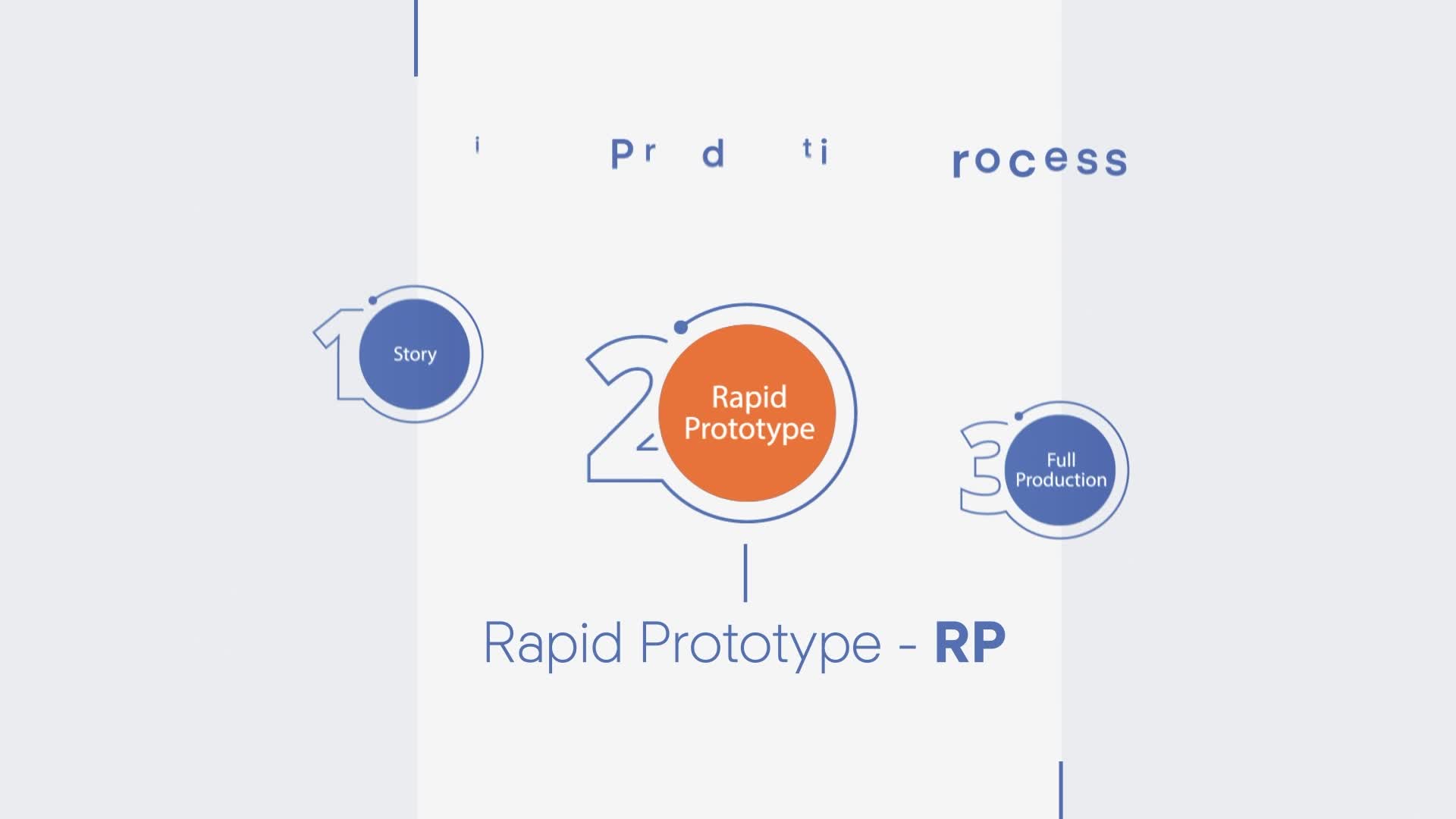
Rapid Prototyping (RP)
We kicked off Rapid Prototyping by blocking out rough versions of each key scene in After Effects. Focus was on spatial logic—how interface tiles, connectors, and text played together on-screen. Each quadrant tile—Stackmap, Stackflow, Stackops, Stackview—was treated like a draggable block in a living system, giving us room to test transitions and behavior quickly. We mapped out how the story moved spatially: when to go wide, when to zoom into detail. These early tests laid the foundation for how scenes flowed into each other.
We paired rough visuals with scratch VO, using temp assets to dial in pacing and structure. We pulled screenshots and graphics directly from the Narrowstack material to rough in layout and flow. Everything evolved together—script, visuals, animation—until the shape was clear.
The spiral of integrations brought a unique challenge. Early tests were either chaotic or too sluggish. We honed it into a clean inward spiral, visually zooming from noise to signal. Using bezier curves, easing tweaks, and tight timing cycles, we gave the spiral structure and clarity. This was the one shot we built in Cinema 4D to keep control over scale and repeatability. A Cloner object and MultiShader setup let us distribute dozens of logos procedurally across the spiral.
Everything else stayed in After Effects. During prototyping, we roughed in the hero green connector line—it needed to guide the viewer through multiple scenes and transitions without breaking flow. We synced transitions and tile behaviors to this line, making sure it pulled the viewer cleanly from beat to beat.
Early Visual Styles Explored
We explored light and dark modes from the start. White-background vector scenes tackled user pain points, while charcoal-black scenes showcased the Narrowstack platform. This visual contrast became a rhythm—old chaos vs. new clarity.
Clarity and legibility were non-negotiable. Human-focused metaphors used thick strokes (stick figures, broken interfaces), while system views used finer lines and teal highlights. Color had a job: white signaled friction, dark grey meant control, teal showed system intelligence. Visual hierarchy came through stroke weight, placement, and movement. We tested countless spiral versions—some overloaded with dots, some way too fast. It took time to find the balance: scale without overwhelm.
Iconography was stripped to essentials, leaning into flat design. We repeated connector lines, quadrant boxes, and stacked layers to build a consistent Narrowstack visual language. In motion studies, we tuned every movement to feel intentional—anticipatory, with smart easing—never decorative.
All animation logic lived in After Effects, powered by shape layers and expressions. Connectors were rigged to nulls, so interface tiles and text could move fluidly without losing structure. This was critical for shots like the Capabilities Map zoom, where high-level categories break into nested parts but still stay logically grouped.
Client Feedback Shaping Direction
Client feedback focused on keeping the visuals logical and the story tight. They loved the quadrant layout and color work but wanted transitions between pain points and solutions to feel more deliberate. We responded by adding stronger cause-and-effect animations—data flowing between modules, tiles snapping into place, connectors pulsing with narration.
A big revision involved the Capabilities and Landscape Maps. The client wanted more obvious hierarchy and smoother zoom logic. We restructured these scenes to start broad, then zoom into nested elements using camera rigs and scale transitions. This meant rebuilding parts of the After Effects comps to nest animation groups and set up smart zoom behaviors.
Text treatment also changed based on feedback. We pulled out early caption-style blocks and replaced them with native UI-style labels that animated in alongside the visual elements. This lowered the cognitive load and leaned harder into the platform-native feel. Every feedback round zeroed in on one question: does the system flow make sense? Spiral to quadrant, to map, to real-world UI—it all had to feel like one connected path.
Look Development
We stayed locked in on consistency, clarity, and control. The color palette was kept tight—white, charcoal, teal, and accent orange. Text used bold sans-serif fonts, spaced for legibility, built into the design rather than floating on top.
Assets were vector-based, designed in Illustrator, and imported as layered comps. We built rules for alignment, padding, and stroke weights to keep tiles modular and clean. Drop shadows were used sparingly—just enough to build hierarchy while staying true to the flat aesthetic.
Where modules needed to react to data, we layered in animated trim paths and repeaters to simulate system feedback—without clutter. Animations were built on a grid to ensure smooth zooms and camera moves stayed predictable and controlled.
Design & Animation
Final animation happened almost entirely in After Effects using vector shape layers and expressions. Parenting assets to nulls allowed reuse across the timeline without breaking structure. Each quadrant—Stackmap, Stackflow, etc.—was built as a master comp and reused for consistency.
Scenes were laid out like spatial environments. For the Landscape Map, we nested comps to simulate vertical scrolling—categories expanded and collapsed in sync with VO. In the Field Tech dashboard, data moved between modules and callouts, mirroring live system behavior.
Once RP was locked, the final phase focused on finesse: easing, motion tuning, and secondary animations to add richness without sacrificing clarity.
Style Choices and Reasoning
Choosing a 2D conceptual style made sense for Narrowstack’s story. Their platform is modular, scalable, and built for clarity—and the flat animation language matched that behavior. Interfaces, connectors, dashboards—it all came through clean, sharp, and unambiguous.
White backgrounds showed user pain—open, scattered, disorganized. Dark scenes marked the shift to platform control. The contrast between the two underscored the transformation and supported the narrative arc.
Teal was used with intention. Every time it appeared, it represented system intelligence—flows, integrations, signal. By keeping it reserved, we gave it real meaning and made sure it stood out every time.
Technical Details
We rendered everything out of After Effects through Adobe Media Encoder with lossless settings for clean post. Illustrator was the base for icon and UI asset design, with layered AI files imported for flexibility.
Animations were powered by expressions—auto-orienting connectors, trim path pulses, and smart fades. Zoom sequences used null-driven camera rigs, with linked position and scale settings that kept things tidy and easy to adjust.
We built compositing-ready scenes by pre-flattening animated groups, which made transitions easier to manage. Rough cuts came out at low res during testing; finals were exported at full resolution and spec.
Final Compositing & Color Grading
Compositing and color grading happened in After Effects using adjustment layers. We used curves to balance the contrast in darker scenes, subtle glows on teal connectors, and soft blurs to draw the eye during data-heavy sections.
Each quadrant module got a custom color pass to make sure it looked consistent wherever it showed up. Scene transitions were color-matched using shared backgrounds and carryover animations.
Text had motion blur and anti-aliasing turned on for sharpness. Final render passes included alpha channels where needed for social cutdowns or overlays.
Infographics, UI Overlays, Data Visualization
Each UI tile worked like a living infographic. Stackflow, Stackmap, and the rest were built as live-feeling dashboards—with updating labels, flowing connectors, and signal pulses. Capabilities and Landscape Maps were scrollable data systems with clearly labeled nodes, built to read like internal diagrams.
Connectors were timed to the VO to visually back up how modules linked together. Data visuals stayed abstract but logical—spinning integrations, pipelines, growing tile stacks—to show systems in motion without depending on hard numbers.
Brand Consistency
Typography, layout, and color stayed aligned with the brand template we set early in look development. Client logos were animated into the final scenes using motion reveals and clean grid placements.
We reviewed all color passes in full context to make sure teal always carried meaning and held visual weight. Text styles were standardized across scenes, and transitions followed a shared easing logic to stay smooth and brand-consistent.
Collaboration & Revisions in Post
Final feedback rounds zeroed in on polish—text timing, zoom smoothness, and overall pacing. We refined the Capabilities Map zoom and cleaned up the quadrant entrances so they better matched narration beats. Small tweaks included pulse timing, glow tweaks, and color rebalancing.
We also fine-tuned transitions between sections—especially the shift into and out of the Field Tech dashboard—to ensure it felt like a clear endpoint to the system journey.
Delivery
Final delivery included a 1080p H.264 version, a high-bitrate master, stills from key scenes, and an SRT file for subtitles. Assets were optimized for web and event use. We also delivered a silent loop of the quadrant tile system for use at trade shows or embedded site loops. All files were fully branded, color-matched, and exported to Narrowstack’s specs.
Transcript:
The typical organization now uses over a hundred software applications …
No wonder so many companies are plagued with technology fatigue, disconnected workflows, and operational indecision.
If that’s you, it’s time to bring some clarity to your operations. It’s time to Narrowstack. Here’s how it works.
Our proprietary process is map > flow > view > ops. These are the steps we take to narrow the stack. So no matter your industry, we guide you through our capabilities map that highlights your operational opportunities … And our landscape map showing you what works, what needs to change, and what needs to just go.
These parts of our process lay out a clear path of growth going forward. Then, using your data our team handles the Stackflow integration. Resulting in a brand new, user-friendly Stackview dashboard, measuring the key metrics you need to know as you grow your business.
And we’ll manage it all for you.
Beat software overload and stack map your way to health with solution precision from Narrowstack.